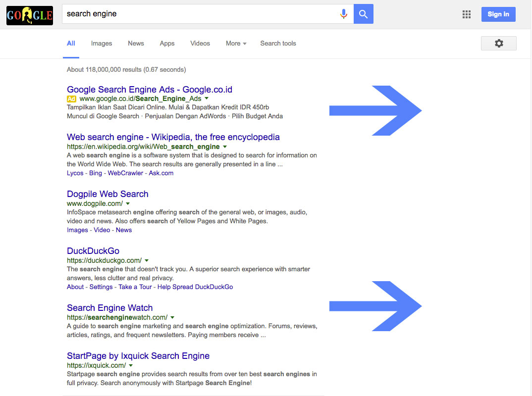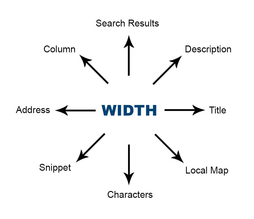
Google has recently increased the width of its main search results column. The increase might not be very significant, but it does cause significant effect to how search result items and other search result elements appear on SERPs. Will this increase also cause effect to your website’s SEO? Here we are going to discuss in deep about this increase, search result elements that are affected, and potential effect to SEO.
What Has Changed
The main search results column that exhibits all organic search result items has just received a tweak. Previously, the width of this column is 500 pixels. Now its width has increased by 100 pixels, giving it a total 600 pixels of width and forcing the right sidebar to shift rightward and to receive some changes as well. In addition, the white space between the main column and sidebar has been narrowed down from 65 pixels to 60 pixels.

How Does This Change Affect SERP’s Elements?
Various elements appearing on SERPs are obviously affected by this change. We can start with the main element that appears on the main search result column, i.e. the organic search result items. With the increase of the column’s width, search result items will now appear wider. Every search result item is now not as tall as it used to be because with the increased column width, its description now requires fewer lines to be displayed on the screen. This consequently will affect the number of organic search result items that will appear on the screen. With all search result items getting shorter, the screen can now display more search result items, thereby decreasing the need of scrolling and rendering once obscured search result items visible.
Every component of the search result item will also be affected. Their title can now occupy wider space in the search result column. This means more characters can be included in the title, which is now capable to include about 70 or 71 characters, compared to 60 characters before the tweak. It has been a common norm that if the tile of a search result item is too long, Google will truncate it and add an ellipsis (…) at the end of it, making it less intelligible and less catchy. With the new width, about one or two words can be added to the title before an ellipsis steps in.
Wider column also means more characters and words per line in the search result item’s description. The length of the description before the change of the width is about 80 to 85 characters per line. Now it has increased to about 100 characters per line. It is worth-mentioning, though, that this tweak is yet to cause the ellipsis in the description to be pushed further to the end, allowing more words to appear in it, like the case with search result item’s title. The position of the ellipsis remains unchanged, meaning that you can’t yet add more words to your meta description to avoid the ellipsis. At the present, this tweak only causes the description to occupy fewer lines and causes the search result item to become less tall than it used to be, as we have explained above.
Another element in the main column that will also be affected is the featured snippet. With the width increase, featured snippet on the top of the page will be significantly wider, allowing more characters to occupy every line of it. However, like what happens to the description, this increase of width doesn’t cause the featured snippet to include more words; it simply becomes wider horizontally and shorter vertically. Nevertheless, the title that appears at the bottom of the snippet now includes more characters before ellipsis is added.
The added width pushes the right column rightward. As a consequence, you can expect changes in elements that are located on the right column, especially the local map packs. Local map packs indeed receive some tweak, both due to the widening of the main column and due to some independent tweaks. It becomes wider to the extent that its width is similar to that of featured snippet. The business info that appears on local map packs also becomes more detailed with street address written in full.
Google’s knowledge panel, which is also located on the right sidebar, appears not to show any changes. Its width is still the same and no adjustment to its design is detected.

How Does This Change Affect SEO?
A component that is most significantly affected by this change is the title, both the one that appears in the search result item and the one that appears in the featured snippet. As the column becomes wider, the title can now include more characters with the disrupting ellipsis pushed further to the end. If you previously struggle to keep your long-tail title short so as not to allow ellipsis to obstruct it, now you can feel more relieved as adding one or two words to your title will no longer hurt.
We are expecting that Google does the same to description and, consecutively, featured snippet. With the possibility of adding characters and words to meta description, making the content of a website catchier and more intelligible becomes easier. However, if this is done to search result item’s description, all search result items will regain their tallness, sacrificing search result items with lower rank and causing them to return to obscurity. This is possibly the reason why the widening of main search result column is not accompanied with any significant tweaking of search result item’s description.
The revamping of local map packs is certainly an advantage for websites targeting local SEO. With local map packs panel that becomes wider and business information that becomes more detailed, anything that is featured in the local map packs will more likely to gain higher click-through rate. Another factor that causes this tweak to affect local SEO is the tweak’s pervasiveness. At the present, similar tweak has been found in many localized versions of Google. Ones that are already confirmed include Google.co.in, Google.co.uk, Google.ca, Google.co.au.
Be our client today to get a Pre-SEO Analysis jump-start for your website. It's a free assessment and 100% awesome.
Let's do it